Meanwhile, on the other side of the world..

art
While art has been flourishing in the West, it's branches have also been growing on the other side of planet earth. It's like art binds the whole world together! :)

Art Beyond the West
     African                    Indian
     Islamic                    Chinese
     Oceanic                   Japanese
     Native American


SUBJECT MATTER: religion, shrines
STYLE: symbolism, realism, naturalism, abstractionism

Here are some examples of art that were developed in places other than the West:


"Altar of the Hand and Arm" by Benin Nigeria
The king in this artwork has a triangular apex which signifies that he is the leader.

(African)


"The Ruler of Orangun-Ila" Airowayoye I
The height of the crown of the ruler means that he is the center of power.

(African)


"Nkisi Nkondi" (hunter figure)
Nkisi means spiritual charm while Nkondi stands for carved power.

(African)


"The Great Mosque" Djenne Mali

              • ferey = sun-baked earth bricks
              • rodier palm/toron = spikes
(Oceanic)


"Great Stone Figures" on Easter Island
These figures are 60 feet tall. It shows a belief that political power is equal to spiritual power.

(Oceanic)


"Castas" by Miguel Cabrera
This painting is a depiction of racial mixtures through marriage of two cultures. Castas = mestizo, referring to the children. The father is European while the mother's Native American.

(Spain)


"Taj Mahal"
Originally built as a mausoleum. Pure marble

(Islamic)


"The Great Stupa"
The fence is called the vedika (separation of heaveny & earthly). The dome represents the sky. Pilgrims circumnavigate the structure clockwise, repeating the movement of the sun across the sky. Most of their rituals are done outside the dome. (Indian)


"Fan K'uan" Travellers Among Mountains and Streams
This artwork does not show any vanishing points.

(Chinese)


"Sudden Rain at Atake and Ohashi" by Andro Hiroshige
This is light-colored because it is a woodblock print.
It was imitated by the famous artist, Vincent Van Gogh


(Japanese)


"Bridge in the Rain" by Vincent Van Gogh
Van Gogh's version of the "Sudden Rain at Atake and Ohashi"

(Post-impressionism)

An Age of Genius

art
If you thought the Renaissance artworks were awesome, I bet you'll have new favourites when you get to read about the Baroque era. I like this era a lot because it upgraded the artistic style artists once had. This is art version 2.0 :)

Anatomyyy!
PLACE: Italy & Spain
NAME DERIVED FROM: Barocco, a misshapen pearl
UPGRADES: motion, space, time, use of light, drama
PRINCIPLE: "Good color is more important than perfect drawing.." See? That's why I love this!! Lol sabi nga nila, "Relate much?"


Those things up there practically tell everything about Baroque artworks. They are full of life, emotions, stories, and also colour. Here are my favourite ones:

#1: The Ecstasy of St. Theresa

St. Theresa is a nun who believed that a pain in her side was caused by an angel of God stabbing her repeatedly with a fire-tipped arrow (that's why her face here shows combined pain & pleasure). This sculpture depicts uncontrollable passion and definitely theatrical drama. Just look at her face! 


#2: Juidth

Well, there are actually 2 artworks for this one. The first is Judith and Holofernes and the other is Judith Decapitating Holofernes. What I like here aren't really the paintings but the way they are different from each other.

by Caravaggio
The story:
Judith was a Jewish widow of noble rank in Bethulia, a town besieged by the army of the Assyrian general Holofernes. She approached his tent as an emissary and captivated him with her beauty. He ordered a feast with much wine. After he passed out in his tent, Judith and her maid Abra saw their opportunity. Judith decapitated Holofernes with his sword and smuggled his head back to Bethulia. On seeing her trophy, the townsfolk routed the leaderless Assyrians. The story is an allegory picturing Judith as Judaism in triumph over its pagan enemy.

The first Judith is made by Caravaggio. It shows Judith killing the tyrant Holofernes who was said to have liked her. Here, she seems unsure and she is being "guided" (umm..if that's an appropriate term for teaching someone how to murder?) by an old woman. She even seems disgusted with the sight of the head being cut off. 

The second Judith is by Artemisia Gentileschi. Her work is a more violent and a bloodier version. Her style bears some resemblance to that of her father, who was a follower of Caravaggio, but Artemisia’s paintings stand out for their theatricality—the raw emotional intensity of a few figures daringly arranged. This specific artwork shows a bolder Judith who seems to be very determined in killing Holofernes. She doesn't look like she's being guided by the other woman anymore but it seems like she's only being helped in killing the man. 

Okay, here comes the interesting part...

The brutal depiction in the monumental Judith Slaying Holofernes is often interpreted as a painted revenge for the artist's experience. At the age of 18, Artemisia was raped by one of her father’s colleagues, Agostino Tassi. He was convicted in a trial a year later after Artemisia was tortured to “confirm” her testimony, but Tassi was never punished. Within months of the conclusion of the trial, Artemisia was quickly married and moved to Florence with her new husband.

When I found out about this, I was like, "Woah, so that's why her work was more *insert explosion sfx*!!" Artists really do paint better if their concept reflects their own experiences.

Moving on...

#3: Happy Accidents of the Swing

The interpretation of this artwork is as simple as its title. Here, Fragonard painted three people - the maiden, the Bishop pushing the swing, and the gentleman who's not actually gentle. Just look at the painting..


You still don't get it?

It's called the "Happy Accidents of the Swing" because the gentleman seems to be delighted with the view while the maiden is enjoying while swinging to and fro. :))

Well, I liked this the first time I saw it because of the way it was painted (the dress is just beautiful!). I didn't even know that the "gentleman" was being portrayed that way. Now, I find this both disgusting and funny, 'cause, guys..please, we are not objects and this isn't how you treat ladies! :p

But I still think the dress is pretty :)

____

Okay, so there you have it..a taste of Baroque period!
I'm gonna wrap things up by saying that how Baroque gave justice to what the Renaissance era has started amazes me :)

This era is probably the one that influenced us the most since we are obviously huge fans of inserting motion, space, time, use of light,  especially drama in our own artworks. Hooray, Baroque!

photos from Google

Blooming ka ngayon ah!

art
Hi! You have just reached my 16th blog post! :) Yep, I am guilty of missing one entry *cries in the corner* but I am so excited that I get to blog about my own report now. The report itself was crazy! I got a bit dazed with the art exhibit + CASFA tasks so I kind of lost track of the preparations for our report. I faced the consequences already </3 However, I’m grateful that it became easier to start the reporting because our jobs as the curators during the exhibit served as a “practice” for the day of our presentation.

I am about to blog my heart out of this entry so buckle up! :)


The Renaissance is the fourth era in the history of art. Well, in world history it would be the fifth age but because art was barren (more like dead) in the Dark Ages, ⃪    this era wasn't considered part of the art history which makes the Renaissance the 4th. Get it? During those times were 700 years of war, poverty, and plague..some historians say that these are due to the crusades or "holy wars" in the Christian Art era. The dark ages meant a constant drain of resources and a standstill in cultural growth.

Now, the Renaissance is a French word that literally means "rebirth."  It's a time of the bloom, rediscovery, and use of classical learning, a revival of the artistic and cultural classical sources including knowledge and attitudes from Ancient Greek and Roman eras. This era serves as the bridge between the middle ages and modern history and this is all about getting it all back and making it better. :)

Here's a short "anatomy" of the Renaissance era:
BIRTHPLACE: Florence, Italy
SUBJECT MATTER: people, religion
STYLE: realism, naturalism (keen observation; humanism bc of Greek philosophy), symbolism (illustrated texts)
TECHNIQUE: “trick-the-eye” or "trompe l'oeil" (read as tromp-loi) rendition of things in this world, meaning religious or mystical-looking but still realistic,


and exact representation (exactness originated in manuscript illumination where complicated imagery was reduced to a minute scale)
MEDIUM: wood, plaster, canvas, tempera, oil, fresco, bronze, marble

The artists in this era payed so much attention to details. They got this from the illuminated manuscripts in the Christian art, these are hand-drawn pages in books and was explained by Michael in the past lesson, Christian art. :) The thumbnail sketches were enlarged to fill greater portions of the manuscript page, eventually covering it entirely. The text pages were not enough to contain the detailed imagery anymore so the artists shifted to painting in tempera on wood panels. 

The "May" page of thLes Très Riches
Heures 
calendar
One of the most dazzling texts available to illustrate this imagery shifting is Les Très Riches Heures du Duc de Berry, a Book of Hours illustrated by the Limbourg brothers. These kinds of books were used by the rich people as prayer books and included psalms and prayers to a variety of saints. Just like most Books of Hours, Les Très Riches Heures contained calendar pages that illustrated domestic tasks and social events of the 12 months of the year. In “May” (R-1 in compilation), one of the calendar pages, we witness a parade of aristocratic gentlemen and ladies who have come in their bejeweled costumes of pastel hues to celebrate the first day of May. The entourage romps through a woodland clearing on carousel-like horses and in the background looms a spectacular castle complex, the chateau of Riom.

The calendar pages of Les Très Riches Heures are rendered in the International style, a manner of painting common throughout Europe during the late 14th and early 15th centuries. This style is characterized by ornate costumes decarated with gold leaf and by subject matter literally fit for a king, including courtly scenes and splendid processions.

15th century artists tried to use objects and scenes from everyday life with religious subjects by using symbolism. To them, even the smallest detail may mean something more than meets the eye.

Merode Altarpiece by Robert Campin


Attention to detail and the use of commonplace settings were carried forward in the soberly realistic religious figures painted by Robert Campin, the Master of Flémalle. He painted a triptych (a picture or relief carving on three panels, typically hinged together) called the Merode Altarpiece. It contains the kneeling donors of the altarpiece; an Annunciation scene with the Virgin Mary and the angel Gabriel; and Joseph, the foster father of Jesus, at work in his carpentry shop. The donors kneel by the doorstep in a garden thick with grass and wildflowers, and each of those has special symbolic significance regarding the Virgin Mary. Although the door is slightly open, it is not clear whether they are witnessing the event inside or whether Campin has used the open door as a compositional device to lead the spectator’s eye into the central panel of the triptych. This painting holds a lot of symbolism like the closed outdoor garden, the spotless room, and the vase of lilies symbolize the holiness and purity of the Virgin Mary, the bronze kettle symbolizes the Virgin’s body because it will be the spotless container of the Redeemer. In the upper left corner of the central panel, a small child can be seen, bearing a cross and riding streams of “divine light.” The wooden table situated between Mary and Gabriel and the room divider between Mary and Joseph guarantee that the light accomplished the deed. Joseph is also shown as a man too old to have been the biological father of Jesus. Here, he is preparing mousetraps – a symbolism that means Christ was the bait with which Satan would be trapped.


During the fifteenth century in northern Europe, we have the development of what is known as genre painting which depicts ordinary people engaged in run-of-the-mill activities. These paintings make little or no reference to religion; they exist almost as art for art’s sake. Yet they are no less devoid of symbolism. One example of this is a painting called Giovanni Arnolfini and His Bride by Jan Van Eyck, one of my favorites! This was commissioned by an Italian businessman to serve as a marriage contract or a record of the couple’s taking of marriage. Cool, huh? The figures of the two witnesses are reflected in the convex mirror behind the Arnolfinis. Believe it or not, they are Jan van Eyck and his wife, a fact corroborated by the inscription above the mirror: “Jan van Eyck was here.” The furry dog in the foreground symbolizes loyalty, and the oranges on the windowsill may symbolize victory over death.


Remember when I said that this era is also about reviving the classical art? Here's one artwork that shows the idealistic style of the classical artists.
Albrecht Dürer and his passion for the Classical in art stimulated extensive travel in Italy, where he copied the works of the Italian masters, who were also captured with the Classical style. The development of the printing press made it possible for him to disseminate the works of the Italian masters throughout northern Europe.


Dürer’s Adam and Eve conveys his admiration for the Classical style. In contrast to other German and Flemish artists who rendered figures, Dürer emphasized the idealized beauty of the human body. His Adam and Eve are not everyday figures of the sort Campin depicted in his Virgin Mary. Instead, the images arise from Greek and Roman prototypes. Adam’s young, muscular body could have been drawn from a live model or from Classical statuary. Eve represents a standard of beauty different from that of other northern artists. The familiar slight build and refined facial features have given way to a more substantial and well-rounded woman. Her features and pose remind us of Venus. The symbols associated with the event—the Tree of Knowledge and the Serpent (Satan)—play a secondary role. In Adam and Eve, Dürer has chosen to emphasize the profound beauty of the human body. Instead of focusing on the consequences of the event preceding the taking of the fruit as an admonition against sin, we delight in the couple’s beauty for its own sake. Indeed, this concept is central to the art of Renaissance Italy.

Now, the Renaissance is not just a time of revival for the classical art. It was also a time of competition between artists since art took flight already. They all wanted to show off and make different versions of each other's artworks. There are 2 remarkable people who competed against each other during this era - Cimabue and Giotto.

These two artists became rivals in this period. Cimbaue was older than Giotto and probably had a formative influence on the latter, who would ultimately steal the limelight. The comparison of their works can be seen in their paintings depicting the Madonna and child enthroned.

There were lots of comparisons during the Renaissance era


This is Cimbaue’s version of the painting:
The massive throne of the Madonna is Roman in inspiration, with column and arch forms decorated with intarsia (small, highly polished stones set in a marble matrix). The Madonna has a physical presence that sets her apart from “floating” medieval figures, but the effect is compromised by the unsureness with which she is placed on the throne. She does not sit solidly; her limbs are not firmly planted. Rather, the legs resemble the hinged appendages of Romanesque figures. This characteristic placement of the knees causes the drapery to fall in predictable folds— concentric arcs reminiscent of a more stylized technique. The angels supporting the throne rise parallel to it, their glances forming an abstract zigzag pattern. The resultant lyrical arabesque, the flickering color patterns of the wings, and the lineup of unobstructed heads recall the Byzantine tradition.

Now let’s look at Giotto’s version:
This is opposite to Cimbaue’s version. She sits firmly on her throne, the outlines of her body and drapery forming a solid triangular shape. Although the throne is lighter in appearance than Cimabue’s Roman throne—and is, in fact, Gothic, with pointed arches—it, too, seems more firmly planted on the earth. Giotto’s genius is also evident in his conception of the forms in three-dimensional space. They not only have height and width, as do those of Cimabue, but they also have depth and mass. This is particularly noticeable in the treatment of the angels. Their location in space is from front to rear rather than atop one another as in Cimabue’s composition. The halos of the foreground angels obscure the faces of the background attendants, because they have mass and occupy space.

Another pair of artists were Ghiberti and Brunelleschi.
Imagine workshops and artists abuzz with news of one of the hottest projects in memory up for grabs. Think of one of the most prestigious architectural sites in Florence. Savor the possibility of being known as the artist who had cast, in gleaming bronze, the massive doors of the Baptistery of Florence. This landmark competition was held in 1401. There were countless entries, but only two panels have come down to us. The artists had been given a scene from the Old Testament to translate into bronze—the sacrifice of Isaac by his father, Abraham. There were specifications, naturally, but the most obvious is the quatrefoil format, an ornamental design of four lobes or leaves as used in architectural tracery, resembling a flower or clover leaf.

The two panels that survived were executed by Filippo Brunelleschi and Lorenzo Ghiberti. The obligatory characters—bushes, animals, and altar—are present in both, but the placement of these elements, the artistic style, and the emotional energy within each work differ considerably. Brunelleschi’s panel is divided into sections by strong vertical and horizontal elements, each section filled with objects and figures. In contrast to the rigidity of the format, a ferocious energy bordering on violence fills the composition. Isaac’s neck and body are distorted by his father’s grasping fist, and Abraham lunges viciously toward his son’s throat with a knife. With similar passion, an angel flies in from the left to grasp Abraham’s arm. But this intense drama was weakened by some figures that were not really necessary in the scene but were given more importance like the donkey. It removes the viewers’ sight from Isaac by being placed in a dead center.

Ghiberti vs. Brunelleschi


In Lorenzo Ghiberti’s panel, the space is divided along a diagonal rock formation that separates the main characters from the lesser ones. Space flows along this diagonal, exposing the figural group of Abraham and Isaac and embracing the shepherd boys and their donkey. The boys and donkey are appropriately subordinated to the main characters but not sidestepped stylistically. Abraham’s lower body parallels the rock formation and then rushes expressively away from it in a dynamic counter thrust. Isaac, in turn, pulls firmly away from his father’s forward motion. The forms move rhythmically together in a continuous flow of space. Although Ghiberti’s emotion is not quite as intense as Brunelleschi’s, and his portrayal of the sacrifice is not quite as graphic, the impact of Ghiberti’s narrative is as strong. It is interesting to note the inclusion of Classicizing elements in both panels. Brunelleschi, in one of his peasants, adapted the Classical sculpture of a boy removing a thorn from his foot, and Ghiberti rendered his Isaac in the manner of the fifth-century sculptor. Isaac’s torso, in fact, may be the first nude in this style since Classical times. 

Obviously, Ghiberti won the competition and Brunelleschi went home with his chisel. The latter never devoted himself to sculpture again but went on to become the first great Renaissance architect. Ghiberti was not particularly humble about his triumph.

As for Brunelleschi, he focused on architecture instead and was even commissioned to cover the crossing square of the cathedral of Florence with a dome. Interestingly, Ghiberti worked with him at the outset but soon bowed out, and Brunelleschi was left to complete the work alone. It was quite an engineering feat, involving a double-shell dome constructed around 24 ribs. Eight of these ribs rise upward to a crowning lantern on the exterior of the dome. The architect might have preferred a more rounded or hemispherical structure, but the engineering problem required an ogival, or pointed, section, which is inherently more stable. The dome was a compromise between a somewhat Classical style and traditional Gothic building principles.


Donatello's David
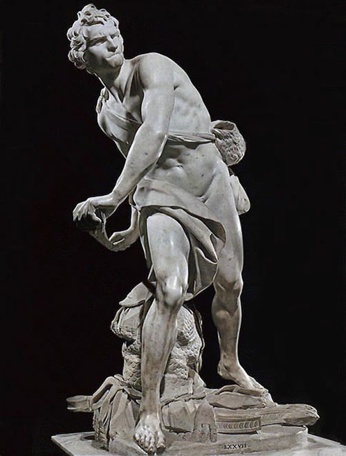
Another interesting comparison in this era are the Davids made by four people - Donatello, Verrocchio, Michelangelo, and Bernini.

Donatello made a nude David, poised in the same contrapposto stance as the victorious athletes of Greece and Rome. But soft, and somehow oddly unheroic. David’s boyish, expressionless face, framed by soft tendrils of hair and shaded by a laurel-crowned peasant’s hat; Goliath’s tragic, contorted expression, made sharper by the pentagonal helmet and coarse, disheveled beard. Innocence and evil. The scuplture's sword is long and is stuck in the ground. This is an after-the-fight version.


Verrocchio's David
Michelangelo's David
Verrocchio also made his own after-the-fight version. Just like Donatello's, his David was also a boy but with a shorter sword. They say the head of this piece is probably the young da Vinci.

Michelangelo, however, created his David out of a block of marble. This is the before-the-fight version because David is still holding his sling and probably still thinking about his attack strategy. Here, David is no longer a boy but a man.


Bernini's David
Bernini isn't originally a Renaissance artist but a Baroque one but he's just here to show off his version of David-hah! Kidding. Anyway, his creation was genius because it's a during-the-fight version. It shows time, space, and most especially, motion. This is also made out of marble and shows a man instead of a boy.


I'd love to tell you more about the Renaissance era (of course, there's still Mona Lisa, the School of Athens, and the Last Supper) but this entry's just getting too long :) I hope you learned something about the rebirth of art through this entry and I hope we all appreciate the significance of this era in the history of art. This was a great turning point in history and it paved the way for even greater freedom in expressing through art.

Keep rocking the free world!

Popular Posts

Like us on Facebook

Flickr Images